Infographics

Grundfos
This piece visually explained how a self-contained, non-polluting fish farm works.

OMEGA Lifetime
This piece showed, in scale, the flight path of the Apollo 11 moon mission, calling out and illustrating key moments.

Harvard Business Review
This piece shows visually how many people moved between several American cities during a four-year period.

The New Republic
This map shows the percentage of hispanic voters in key swings states in the 2006 election as well as their countries of origin.
Fast Company
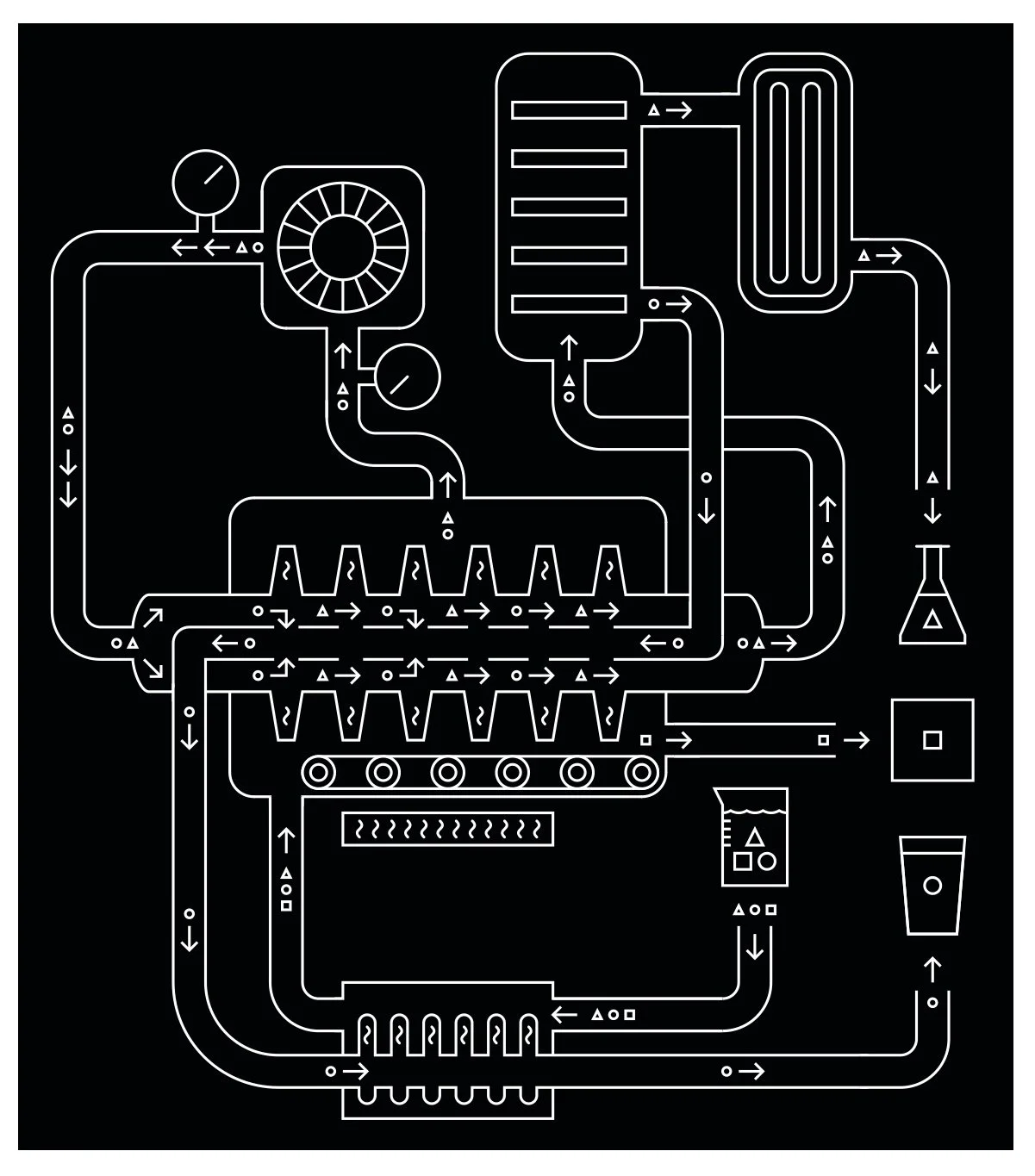
This diagram details the process of dairy cow waste being converted into clean water and fertilizer.
AARP
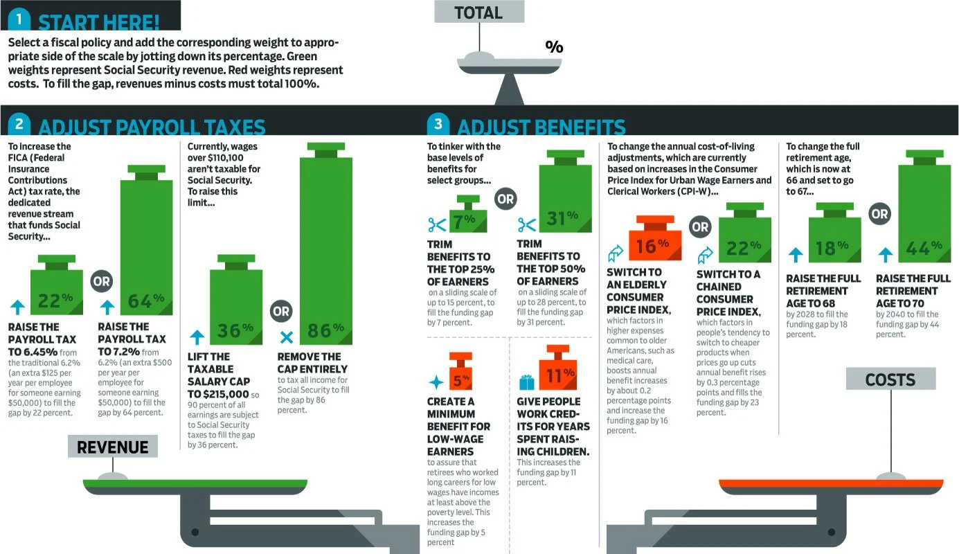
An infographic showing what could be done to balance social security. Every potential change to the budget is shown with its cost or revenue benefit, which corresponds to the size of the weight.
ESPN
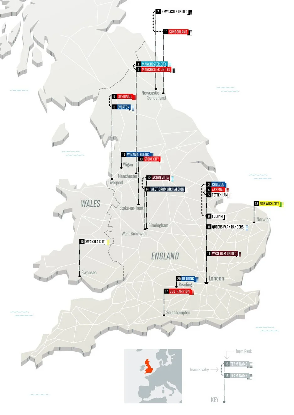
This infographics shows rivalries within the UK's soccer premier league. The taller the flagpole, the higher the team is ranked. Rivalries are shown on the same flagpole with a dotted line.