Branding
Horizon Expander Kaleidoscopes
This logo for a local, mind-expanding kids’s toy evoked exploration by referencing the kind of compass rose found on antique nautical charts.
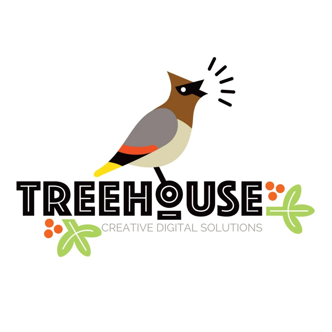
Treehouse Creative
I designed this logo for the San Juan Island-based creative studio, Treehouse. Their logo features a cedar waxwing calling from a branch, a visual analogy for the way their creative studio helps clients call out to the rest of the world through professional branding and communications.
Pairing the logo with a punchy logotype that was nicely integrated with the rest of the mark, made for the beginnings of a beautiful identity.
Two Hands Furniture
This logo played on the idea of love flowing through the hands of the maker into the hearts of those living with the furniture. The logo also functioned as a brand—it was literally burned into the backs of the finished works.
024 Furniture
This logo, for the Two Hands plywood furniture brand, employed san-serif numbers to speak to the precision with which the computer-controlled milling machine cut the parts from which the furniture was made. The numbers had the following symbolic meanings: 0 = new idea, all things possible, 2 = elements coming together to relate in a new way, 4 = joy, harmony, celebration.


